In 2026, skip those icy whites and opt for warm tones instead. Try creamy neutrals like Swiss Coffee for your walls—they’re inviting.
Layer in a moody anchor color like Silhouette on one accent wall for depth. Add earthy greens or muted blues as accents, then keep trim crisp white for contrast. The key? Balance boldness with lighter surfaces so your room feels cohesive, not overwhelming.
Stick around to see exactly how these colors work together.
Why Warmth Beats Flat Neutrals in 2026 Living Rooms
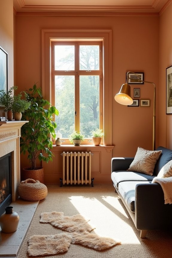
Why do so many living rooms still feel cold and uninviting? I’ve noticed that stark whites and cool grays dominate, leaving spaces feeling sterile. That’s changing in 2026.
Warmer neutrals like creamy whites and warm taupes are replacing those icy tones. They’re gentler on the eyes and actually make you want to spend time in your space. I’m talking about earthy tones—think mushroom browns, clay, and terracotta accents that ground a room.
Palettes that incorporate natural elements bring the outdoors indoors through color, creating spaces that feel calm and supportive. Desert-inspired greens pair beautifully with these warm bases. The shift feels less like a design rule and more like finally giving your living room permission to actually feel welcoming. Your space should invite you in, not push you away.
Moody Anchor Colors: Build Depth With Silhouette Tones
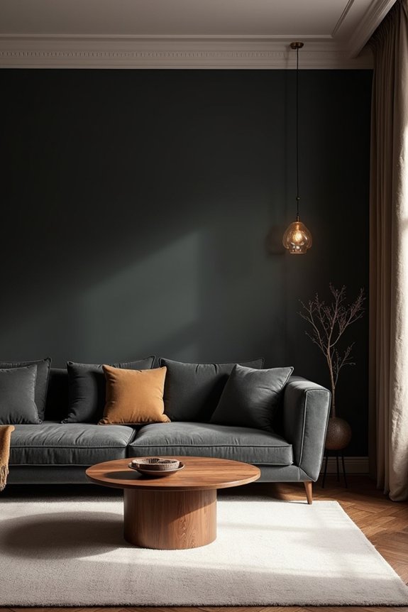
Now that you’ve got warmth flowing through your living room, it’s time to anchor it all with color that actually makes a statement. Silhouette AF-655 is your moody anchor—that deep, burnished tone that grounds everything else beautifully.
Here’s what makes this work:
- Layer with intention: Pair Silhouette with softer neutrals and richer midtones for drama without overwhelming your space
- Create focal points: Use it on an accent wall while keeping trim crisp white or natural wood for contrast
- Balance boldness: Mix those deep tones with delicate pastels and ethereal neutrals to build real depth
Layered neutrals prevent rooms from feeling flat or one-note. Silhouette pulls the whole palette together while giving you that sophisticated, grounded feeling.
Accent Colors for 2026: Earthy Greens and Muted Blues
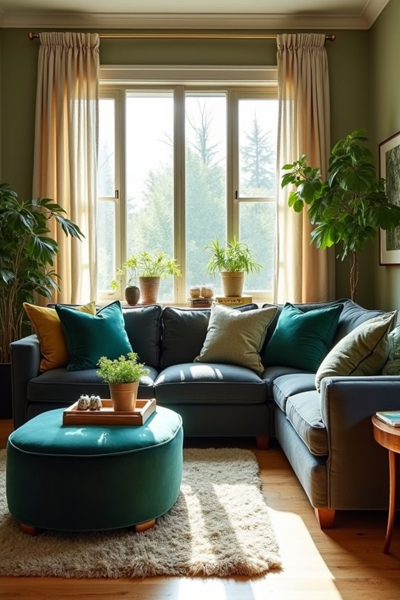
What if the perfect accent color already exists in nature? I’ve found that earthy greens like Narragansett Green create a grounding feeling in my living room. They’re calming without feeling heavy, and they pair beautifully with muted blues for balance.
Here’s what I’ve learned: accent walls using these softer tones work well in a space. I’m not talking bold or overwhelming—think desaturated, ethereal shades instead. The trick is layering deeper greens with lighter neutrals so the room feels open and inviting.
When I painted my accent wall, I paired it with crisp white trim. This contrast keeps things from feeling too dark. Add lighter countertops or backsplashes if you can. The result? A tranquil room that feels considered and naturally sophisticated without any pretense.
Creamy Tones and Warm Taupes: Spacious Backdrops With Character
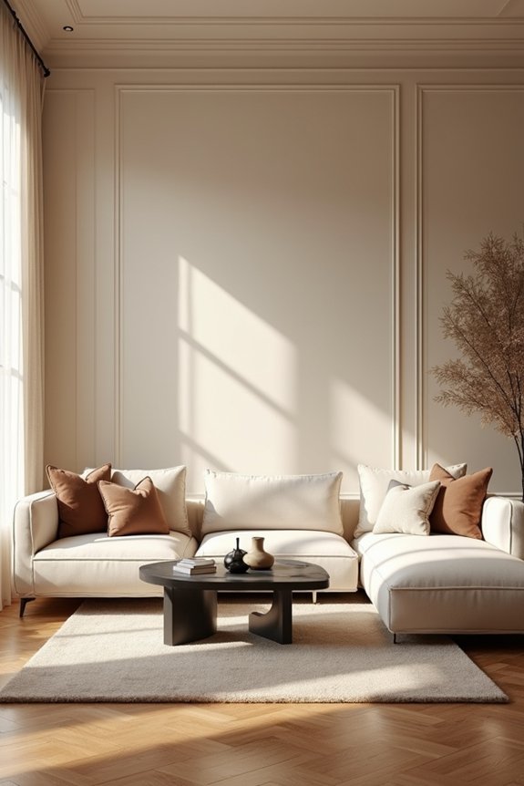
The shift from stark white to creamy neutrals has changed how I think about living room walls. Creamy tones and warm taupes create spacious backdrops with character. These warmer bases feel inviting without demanding attention, which helps ease design decisions.
Here’s what works best:
- Creamy walls let your furniture and accessories be the focal points
- Warm taupes add subtle depth that prevents rooms from feeling flat
- Layering these neutrals with deeper accents maintains dimension throughout the space
When I painted my living room a soft cream, the entire room felt larger and more welcoming. The warmth draws people in naturally. Pairing these spacious backdrops with deeper accent tones creates the calm environment you’re looking for.
Apply Your Palette: Proportions and Layering for Cohesion
Once you’ve settled on your creamy base and accent colors, how you arrange them throughout your space matters significantly. Color palette layering adds dimension to a room.
Here’s what I do: I anchor walls with neutrals like Swiss Coffee, then introduce deeper tones like Narragansett Green strategically. An accent wall featuring Silhouette AF-655 becomes your focal point without overwhelming everything.
For proportions, I keep trim and doors crisp white for contrast. Balance bold colors with plenty of lighter surfaces. I pair layered neutrals with color pops, which adds depth without chaos.
Your kitchen cabinetry and living room should flow together visually. Dark cabinets with lighter countertops mirror this same balanced approach. That’s how spaces feel connected and well-considered.